


My usual process while drawing this comic goes a bit like this: I freak out until I have a decent plan, then once the sketch is in I usually like it a lot. Then I do the flat colors… and I hate it. I have to remind myself that this is simply because it’s not finished yet, because the final shading/layer adjustments REALLY change the vibe of a page. Here’s a few comparisons so you can see what I mean!
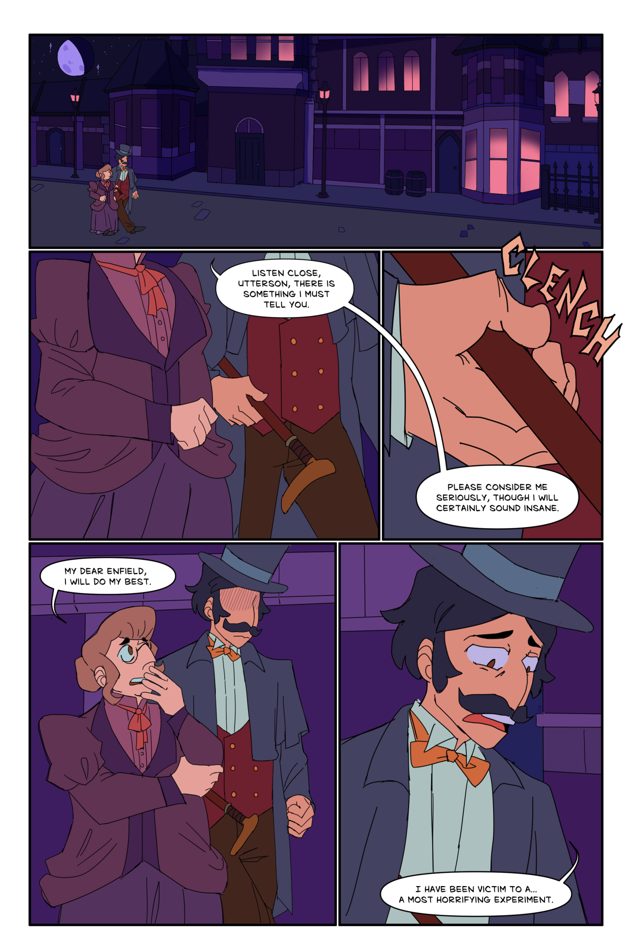
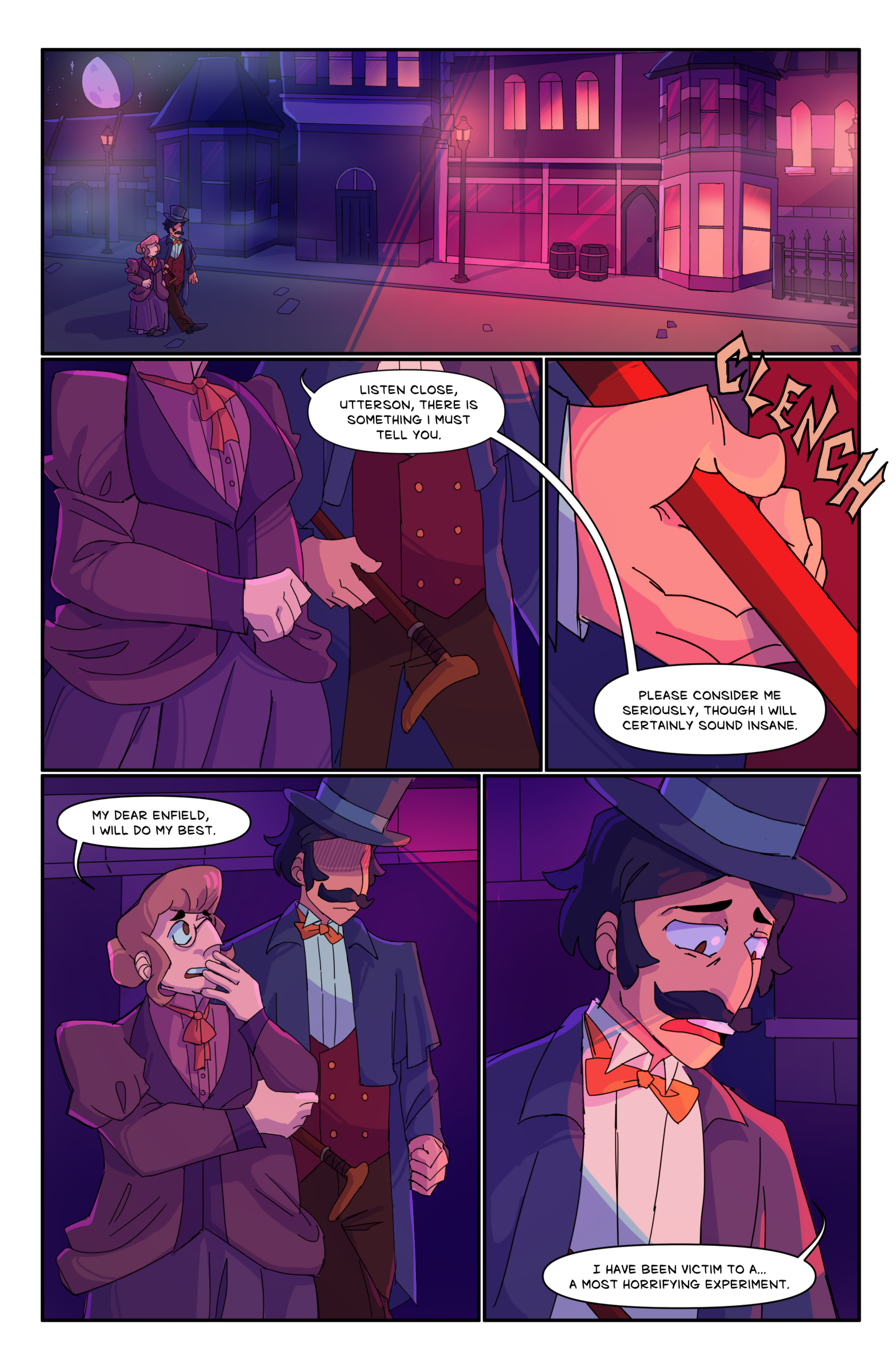
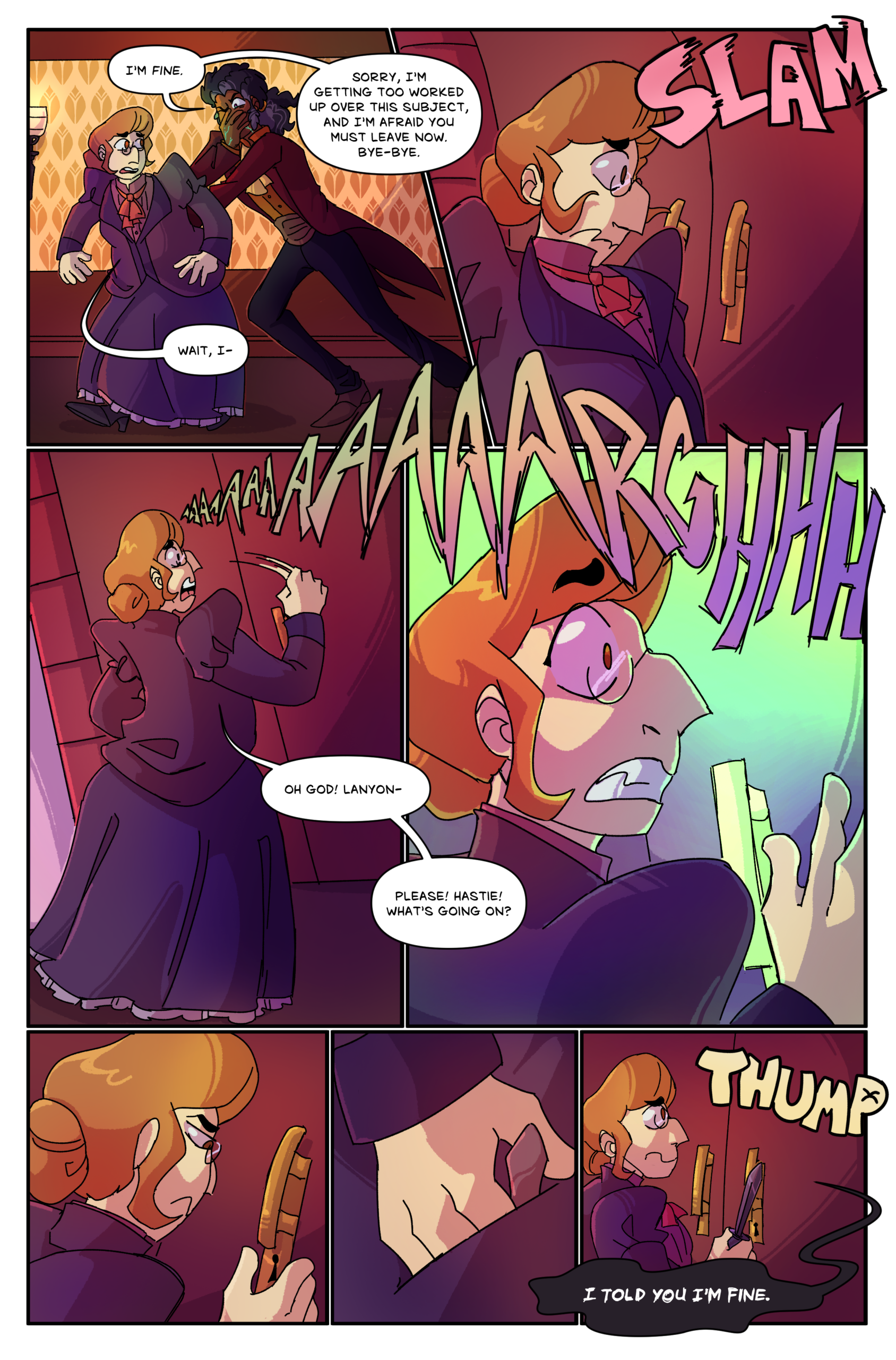
I almost never edit my basic reference colors for flats. It’s much simpler to add adjustment layers to achieve the effect I need. This also makes it less stressful to color a new location- I mostly focus on values over the specific colors working together.
Another huge thing the shading adds is eye direction. I use multiply + overlay layers to lighten areas I want the viewer to focus on, and darken ones I don’t. I also adjust backgrounds that are too similar to the characters, and add pops of unusual colors to break up the monotony of the color palette (I seem to keep doing this with green and purple specifically?)